Monday, May 10, 2010

Time for a haircut?

A little while ago, I wrote here in statistical terms about a trip to my local supermarket.

1 item every 60 seconds. $5 every minute.

And even a brief browse through Freakonomics or their blog will quickly reveal just how much statistics relate to our everyday lives.

All of which brings me to the fact that I got my hair cut the other day. Not a particularly glamorous or extravagant event, as evidenced by the fact that it was a mere snip at $13.

I entered the barbershop at 8.03am.

I was seated by 8.04am.

And I was on my merry way by 8.17am.

$1 a minute.

Not so long ago, I used to get my hair cut at a salon. And, it used to cost me $47 and take about 45 minutes.

Also, $1 a minute.

And when I think about how long my beautiful wife will tend to spend at the salon when she has her hair done, it's generally a 3-hour exercise at a rough cost of $200.

Close enough to $1 a minute.

I'm sure by now you get my point, or at least my hypothesis. That there is no such thing as a cheap or an expensive haircut, only a long or a short one (at an approximate cost of $1 a minute).
Thursday, April 29, 2010

The right brand of coffee

I love coffee. I also enjoy a good conversation. And I'm certainly not immune to a spot of conservation.

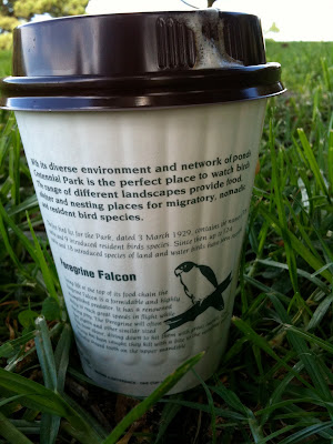
So you can imagine my delight when I came across these takeaway coffee cups at the newly refurbished café at Centennial Park.


They're a great reminder of the natural environment and the wildlife with whom we share the park, as well as a reassuring piece of communication in a world where all too often cost and convenience erase all signs of character.

Now, if only someone could design a better lid.

Tuesday, April 27, 2010

The difference between write and wrong

I receive a fair few résumés in any given week, and more so lately as I'm recruiting for a couple of roles.

Last week was no different, but one résumé in particular stood out from the rest of the bunch, albeit for all the wrong reasons. The front page led with 4 sentences, the first of which contained no less than 44 words and 2 errors – including misspelling the name of a previous agency.

From there, things didn't get any better.

80 words later, and I'd counted another 8 errors. Apostrophes turning up in the wrong places (or not at all), random capitalisation, the odd appearance of an ampersand or two, and commas missing in action or simply dropped into the middle of nowhere.

All I can say is that if you're still struggling with the difference between "who's" and "whose" after 25 years in the communications industry – and as a self-professed writer – then all is not well.

But what also struck me was the complexity of the language for something like a résumé, a piece of communication that ought to be simple, approachable and immediate. I've written here about the fact that using long words does not make you appear smarter (in fact, quite the opposite), and I was also reminded of the Flesch-Kincaid readability test.

This is a test that – as the name suggests – measures how easy it is to read a passage of text, and provides a score on a scale of 0–100. Reader's Digest aims for a score of 65 or more, whereas the Harvard Law Review tends to hover around the 30-mark. So far, this post gets a score of 60.

The 4 sentences on the front page of the résumé achieved a Flesch-Kincaid score of just 16. A pretty ordinary effort when you also consider the number of grammatical errors, and a stark reminder of the power of language, for better or for worse.

I sincerely hope that the author of the résumé finds a role, but I can't say for certain that it will be in communications.

Monday, April 19, 2010

Ads that do no more than pay the Bill

It's been a little while since my last post, but I have renowned chef and restauranteur Bill Granger to thank for giving me just the jab in the kidneys that I needed to get back me into the blog seat.


On this particular occasion, Bill was not plugging his latest book but rather his love for Poliform kitchens – and I'm not surprised given that Bill's one of the few people that could probably afford one. But what grated about the ad that I saw (one of a series of ads including the one shown above) was the complete lack of imagination when it came to the copy.

My Poliform kitchen combines the best ingredients – elegance, functionality and quality and it's not as expensive as you think.

I'm all too well aware that clients often set incredibly tight deadlines, but surely the agency in this case had the time or creativity to do more than simply copy–and–paste the brief into the ad? But then if you don't know what you're doing, even the best ingredients can leave a bad taste.