Showing posts with label communication. Show all posts

Thursday, April 29, 2010

The right brand of coffee

I love coffee. I also enjoy a good conversation. And I'm certainly not immune to a spot of conservation.

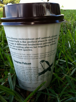
So you can imagine my delight when I came across these takeaway coffee cups at the newly refurbished café at Centennial Park.


They're a great reminder of the natural environment and the wildlife with whom we share the park, as well as a reassuring piece of communication in a world where all too often cost and convenience erase all signs of character.

Now, if only someone could design a better lid.

Tuesday, April 27, 2010

The difference between write and wrong

I receive a fair few résumés in any given week, and more so lately as I'm recruiting for a couple of roles.

Last week was no different, but one résumé in particular stood out from the rest of the bunch, albeit for all the wrong reasons. The front page led with 4 sentences, the first of which contained no less than 44 words and 2 errors – including misspelling the name of a previous agency.

From there, things didn't get any better.

80 words later, and I'd counted another 8 errors. Apostrophes turning up in the wrong places (or not at all), random capitalisation, the odd appearance of an ampersand or two, and commas missing in action or simply dropped into the middle of nowhere.

All I can say is that if you're still struggling with the difference between "who's" and "whose" after 25 years in the communications industry – and as a self-professed writer – then all is not well.

But what also struck me was the complexity of the language for something like a résumé, a piece of communication that ought to be simple, approachable and immediate. I've written here about the fact that using long words does not make you appear smarter (in fact, quite the opposite), and I was also reminded of the Flesch-Kincaid readability test.

This is a test that – as the name suggests – measures how easy it is to read a passage of text, and provides a score on a scale of 0–100. Reader's Digest aims for a score of 65 or more, whereas the Harvard Law Review tends to hover around the 30-mark. So far, this post gets a score of 60.

The 4 sentences on the front page of the résumé achieved a Flesch-Kincaid score of just 16. A pretty ordinary effort when you also consider the number of grammatical errors, and a stark reminder of the power of language, for better or for worse.

I sincerely hope that the author of the résumé finds a role, but I can't say for certain that it will be in communications.

Monday, April 19, 2010

Ads that do no more than pay the Bill

It's been a little while since my last post, but I have renowned chef and restauranteur Bill Granger to thank for giving me just the jab in the kidneys that I needed to get back me into the blog seat.


On this particular occasion, Bill was not plugging his latest book but rather his love for Poliform kitchens – and I'm not surprised given that Bill's one of the few people that could probably afford one. But what grated about the ad that I saw (one of a series of ads including the one shown above) was the complete lack of imagination when it came to the copy.

My Poliform kitchen combines the best ingredients – elegance, functionality and quality and it's not as expensive as you think.

I'm all too well aware that clients often set incredibly tight deadlines, but surely the agency in this case had the time or creativity to do more than simply copy–and–paste the brief into the ad? But then if you don't know what you're doing, even the best ingredients can leave a bad taste.

Monday, March 22, 2010

So good they wrote it twice – or was that three times?

Just last Friday, a good friend pointed me in the direction of what can only be described as a thrilling piece of copywriting.

The quality of the writing and craftsmanship is jaw-dropping. No word of a lie.

And here it is.

But a quick scroll through the comments on YouTube tells another story, one of perceived mistrust and deception. So much so that Penguin published their own blog post to defuse the story and acknowledge their inspiration, even going so far as to include links to two particular videos where this same approach has been used in the past, here and here.

Who knows the true story in terms of how events unfolded? Whether Penguin were transparent from the start or even knew that the video had been posted, or if it was those ever-watchful, web 2.0 vigilantes who caught them out with their own brand of cyber sleuth.

Whatever the case, you can be absolutely sure of one thing.

Jason LaMotte, the chap who wrote the script for the video, is a great writer.

And most certainly a far greater writer than the vapid vultures whose comments have so quickly picked to bits what is otherwise an inspired piece of language and communication.

Right or wrong, inspiration or imitation, I know whose words I'd rather read.

Monday, March 15, 2010

Eyes wide open (thanks, Grace)

Not so long ago, I wrote here about The Writer, just one of many posts about the way in which brands use language to distinguish themselves – in both senses of the word.

And it reminded me of uncompromising brands like Gym Jones, a gym in Utah that prides itself on nothing less than Power, Speed, Endurance, Suffering and Salvation.


As you can read for yourself in this exert from their website, they're pretty serious about what they do (and don't).


I wish more brands took themselves so seriously that they held to such an unwavering view of their place in the world, rather than allow punters to wander into a focus group and make all the important decisions for them. But alas, such instances seem few and far between.

Unless, that is, you know where to look.

It was Grace Coddington, Creative Director of American Vogue, who spoke in The September Issue about how she learnt early in her career that you should always keep your eyes open, never go to sleep in the car or anything like that, keep watching – because whatever you see out the window or wherever, it can inspire you.

And so it was that I found myself staring out of the passenger window on Saturday morning as we drove along the incredibly uninspiring and downright demoralising Parramatta Road.

All these thoughts were rattling around in my head when out of the blue – or should I say gray? – I saw a furniture store called 3 Of A Kind with this brutally honest tagline.

Butt ugly blokes building handsome furniture for beautiful people.

I wish we'd stopped to find out if it was true, but I can only imagine that there's few better places to go if you want an honest piece of original craftsmanship.

And if that wasn't enough, we then drove straight past this tattoo parlour.


Where better to go than the House Of Pain?

Monday, March 8, 2010

365 and counting

This latest post began life as a brief rant by one of my colleagues at work.


Something to do with the fact that Yakult – like so many other brands – are now positioning themselves as every day.

And just in case that phrase is simply too hard for us poor consumers to grasp, they've kindly gone to the trouble of placing their product next to other products that you might also expect to consume every day. In much the same way that orange juice brands like to put a picture of oranges on the front of the pack just in case you weren't sure what a product described as orange juice might contain.


And that was pretty much where my colleague's rant ended. Just another Friday afternoon in the agency.

But it started me thinking about how everything is now becoming marketed as everyday.

We're spruiked everyday low prices. Where everyday matters are the key to everyday living. And we're told to get our everyday money with everyday banking. Because every day is an adventure. Especially if we want to get everyday rewards. Or, even better, be an everyday hero. That's when we can enjoy everyday luxury. In fact, when you think about it, we're just part of everyday.

It's everywhere.

Which is ironic given that we're also being constantly reminded by our marketing masters exactly how time-poor we all are.

So what's going to be? Everyday, or just whenever we can.

Thursday, March 4, 2010

Can I have a small word?

I've been meaning to write this post for months. In fact, ever since I first read about it last August. And once again, I have The Writer to thank, a specialist writing agency in London.


Here's what they had to say.

Long words make you sound thick. Fact.

We’re always banging on in workshops about picking simple words whenever you can. Occasionally, though, someone will pipe up, ‘But I like using long words. They make me look clever, don’t they?’ No, they don’t. And you don’t just have to take our word for it. It’s been scientifically proven – by psychologist Daniel M Oppenheimer, of Princeton University, no less.

A couple of years ago Oppenheimer designed several experiments to test how people reacted to various styles of writing – some straightforward, some complicated. He was particularly interested in trying to find out which writers sounded the cleverest.

And guess what? The writers of clear and simple words were judged as smart, whereas those who used needlessly long words came across as less intelligent and less confident.

His conclusion is emphatic: ‘Write clearly and simply if you can, and you’ll be more likely to be thought of as intelligent.’

If you fancy reading the study yourself, it’s here. It’s rather splendidly called Consequences of Erudite Vernacular Utilized Irrespective of Necessity: Problems with Using Long Words Needlessly.

A brilliant insight, if you ask me. And I'd expect nothing less than that from The Writer, who seem to take as much time over the long words as they do the fine details.

To show exactly what I mean, here's the email signature from their newsletter (double-click on it to see a larger version).


So many people struggle to describe what makes their business or brand different, but here it is, laid out for all to read in something as basic as an email signature.

No multi-million dollar advertising campaign, exhaustive packaging redesign, or public relations crusade required.

Just a few small words say it all.

Saturday, February 20, 2010

Caught in a cliché

The past week's been pretty hectic – meetings, deadlines, missed deadlines, pitches, spreadsheets and other sundry items.

But the memory of one particular meeting still lingers.

Now, I understand as well as the next man that acronyms and jargon have their place in this world. If you're stood in a room full of people who know exactly what you mean when you say EPCM, there's absolutely no point in saying the words in full each and every time you use the term. In fact, in most cases, you would actually look a little foolish. As much as acronyms and jargon are exclusive and, quite literally, exclude the layperson, they can also serve just as positive a purpose by reinforcing communication between those already in-the-know (think of it as the modern day equivalent of the Freemason's handshake).

The clichés of the corporate world suffer a similar fate.

Time and place can play a pivotal role in whether they evoke the right response. But all too often they are mere victims of their own popularity as commonplace phrases – as well as the insincerity (or lack of imagination) on the part of those who invoke their expression.

And so it was that I found myself in a pretty swish boardroom in the CBD.

Stainless steel carafes of filtered water, carefully-placed corporate coasters, and individually-wrapped, no-name mints.

Handshakes, smiles, introductions.

And as the conversation wound into action, one particular person began to say how they had only been involved at certain points in the project. In their own words, they had simply "parachuted in, and then parachuted back out again".

After which point, I spent the remainder of the meeting – and the week – wondering exactly how you parachute out of anything.

I understand parachute in. It's possibly a little lazy, even surreptitiously belligerent (although I should say that military phrases have a nasty habit of popping up in the boardroom a little too often for my liking).

But parachute out? I'm sorry, but that's just dumb.

Sunday, January 31, 2010

An oasis of insight
After reading the title of this post, no doubt you're expecting great things – or, grave disappointment (not that I would hold it against you).

And you'd be right. On both counts.

Welcome to the world of real estate agents, the modern day leaders of literature, who shower us on a weekly basis with all manner of adjectives, superlatives and seductive turns of phrase.

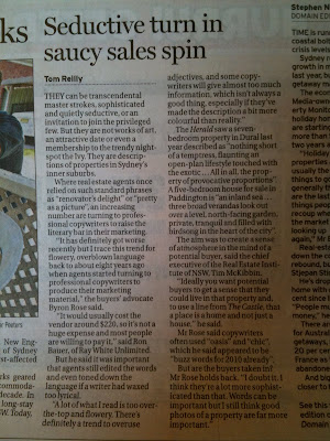
So much so that last weekend's Sydney Morning Herald thrust them into the spotlight with an article entitled Seductive turn in saucy sales spin. Which could have just as well been written by a real estate agent given the fact that the article was neither as seductive nor as saucy as the headline had advertised – the very thing that made me read it in the first place.

For anyone still interested (in spite of the lack of X-rated content), here it is.


As you may have noticed, the article ends with a quote from the aptly-named Byron Rose, who says, "Words can be important, but I still think good photos of a property are far more important".

I can't help but wonder where the facts fit on his scale of importance.

Sunday, January 24, 2010

The post and the poem

This week, a friend of mine tipped me off about a conversation happening here about whether technology is killing the way we communicate.

I posted a comment, and it started me thinking about how everything is now about tweets and updates and txts – basically anything short and sweet that is easy to absorb and doesn't make you think too hard. And while I can appreciate that, I would also like to think that there's still a place in the world for writing that is longer and a little more challenging and creative.

With that in mind, here's something you don't see much these days. A poem.

This one 's by Ted Hughes.

Written in 1957, it's called The Thought-Fox, and it deals with the idea of creativity and the writing process itself. And I hope you enjoy it.

The Thought-Fox
I imagine this midnight moment's forest:
Something else is alive
Beside the clock's loneliness
And this blank page where my fingers move.

Through the window I see no star:
Something more near
Though deeper within darkness
Is entering the loneliness:

Cold, delicately as the dark snow,
A fox's nose touches twig, leaf;
Two eyes serve a movement, that now
And again now, and now, and now

Sets neat prints into the snow
Between trees, and warily a lame
Shadow lags by stump and in hollow
Of a body that is bold to come

Across clearings, an eye,
A widening deepening greenness,
Brilliantly, concentratedly,
Coming about its own business

Till with a sudden sharp hot stink of fox
It enters the dark hole of the head.
The window is starless still; the clock ticks,
The page is printed.

Friday, January 22, 2010

Sex, decks and women's health clubs


Since the last time I wrote about crimes against the English language (shame on you, KFC), a report has been released claiming that the average teenager uses a mere 800 words each day. On this occasion, texting and hip-hop culture seem to be taking the brunt of the blame, but I'm starting to wonder if 800 words a day isn't so bad, so long as they don't include either of the examples that follow in this post.


Most businesses go to market with a new brand or campaign only after months of research and planning. However, Fernwood Women's Health Clubs and Cabot's Clever Deck both seem to have dreamed up their campaigns after watching an episode of "20 To 1: Funniest Ads In The World".


Fernwood would like to have us sniggering at the back of the class with this dumbed-down approach to getting people's attention.


And Clever Deck have really gone to town with some tacky sex gags of their own – lasts twice as long, geddit!


Just to be clear, it's not the swearing or the innuendo that I find offensive, simply the fact that neither is particularly funny or uses humour in some way that is relevant to the brand in question.


My dad always said to me that people who use swear words suffer from a poor range of vocabulary (although I'm not sure if he'd managed to pin it down to greater or less than 800 words).


And I'm now wondering if something similar is true for humour in branding.


In other words, if people rely on cheap, mindless gags to draw attention to their brand, it probably means that they suffer from a poor range of products and services – and they're desperately hoping you won't notice.

Wednesday, January 13, 2010

Death on a whiteboard

If you want to get something done, I've learned you don't write it on a whiteboard.

Over the years, I've had a number of clients with whiteboards mounted on the walls of their offices. Without exception, not much changed from one week to the next. Any scribbles were usually just that – scribbles. One client had even gone to the trouble of marking out a section for his kids to doodle, and I was always intrigued by the idea of holding serious business discussions as Laura woz 'ere would catch my eye across the room.

When it comes to workshops, whiteboards take centre stage. However, it usually doesn't take too long before they start to interrupt rather than illuminate the discussion. There's rarely any pens to hand that work for more than four words, after a couple of lines you start to realise that you're writing on a ridiculous slant that makes everything trail off into the bottom right hand corner, and it's only once you've riddled the board with a sheen of half-baked ideas that you discover you've been writing in permanent ink.

Technology doesn't make things any easier. If you have a whiteboard from which you can make prints, one of three things usually happens: there's no paper, you write on the one screen that doesn't print, or you fail to use the only colour that reproduces with any degree of legibility. And if you're lucky enough to have one of those whiteboards that saves everything to a central hard drive, you can be certain that it will be saved to the hard drive never to be seen again.

Unfortunately – and in spite of my better judgement and past experiences – I recently learned this the hard way.

Our studio is now the proud owner of a brand new, shimmering whiteboard. A breeding ground for cartoons and caricatures, it produces little in the way of insight or efficiency. To make matters worse, it has been hung (professionally, I might add) at the perfect height for anyone below 5 feet tall. Now and then, I stare longingly at the whiteboard, in the desperate hope that it will spring into life, but I'm also slightly worried that it will instead crash to the floor, pinning any nearby designers to the ground.

But then, it could always be worse. We could be having one of those brainstorms where there's no such thing as a bad idea – like buying a whiteboard.

Tuesday, December 29, 2009

Drugs, data and rock 'n' roll

A few months ago, I wrote here about the way in which information is presented, and I included some of my favourite infographics.

Since then, people have written to me with some of their own favourites, and I thought I might end the year with the pick of the bunch. (And, of course, thanks to all the usual suspects – Good, Information Is Beautiful and 99%, among others.)

It's probably best to let them speak for themselves.

So here goes for 2009.

Drugs....


...data...


...and rock 'n' roll.


Wednesday, October 21, 2009

Data is not dull, you are

It was Raymond Loewy, the renowned industrial designer, who once said "the most beautiful curve is a rising sales graph". And he may well have been right.

However, the information we communicate is not always quite so easy on the eye, let alone anything that comes close to being "beautiful". To my mind, sensible spreadsheets and po-faced pie charts only exacerbate mankind's weakness for convenience over character.

But the real poster boy for plain boring must be PowerPoint.

A few years ago, I discovered this PowerPoint version of the Gettysburg Address. An exercise in demonstrating just how far PowerPoint can reduce one of the most inspiring speeches of all time to a rubble of drab and dreary slides. And please don't get me started on clip art.

That said, the other extreme does exist in the form of David Byrne's creative use of PowerPoint as an artistic medium. However, it's not quite the same as using PowerPoint to share basic information, as most of us do on a day-to-day basis. And herein lies the real challenge.

Now I should say I’m not advocating that everyone rush off to design school (although a basic eye for aesthetics might be nice). But what is important is that we all take a moment to consider the poor people who have to wade through all this information that we feel compelled to emit. Because we have to remember that the only reason we ever communicate is to create a response – in the words of one of my favourite writers, the late, great F. Scott Fitzgerald, “You don’t write because you want to say something, you write because you have something to say".

If you communicate because you feel a purely self-motivated, almost evangelical calling to communicate, then go ahead and write 100 PowerPoint slides in 8 point. And help yourself to as much clip art as you can possibly find. In fact, go crazy with the clip art.

But if you choose not to follow this path – and trust me, it is a choice – then you need to think more carefully. Not simply about what you want to say, but more about how you want to say it so that your audience think or feel something in response.

And that’s why I love any software, applications, widgets and websites designed to show information in surprising and delightful ways.

My current favourites are Daytum and Information Is Beautiful, where some of the most mundane data gets presented in some of the most creative and thought-provoking ways. All of sudden, you see how data can take on the character of the story that you want to tell, not simply report the facts and figures in a statistical but ultimately superficial way.

Both take their inspiration from designing information in a way that can help us understand the world around us. David McCandless, who started Information Is Beautiful, describes himself as a visual and data journalist "with a passion for visualising information – facts, data, ideas, subjects, issues, statistics, questions – all with a minimum of words". And with an equally fervent hatred of pie charts.

To show you what I mean, here's the "Billion Dollar Gram" by Information Is Beautiful, which highlights the relative amounts of money spent on all sorts of different bits and pieces.


When you view data through a creative lens, McCandless describes how it can reveal hidden patterns, insights and stories, which strikes a similar note to how Nicholas Felton, Daytum's founder, describes his start. He began by producing yearly tabulations of his life which he called Annual Reports, "a collection of charts and graphs that concentrate the year into statistical chunks and illuminate his life in a wry but rigorous manner", and he then sourced the help of Ryan Case to evolve his basic methodology into a platform for self-expression.

This is the front cover of the 2008 Feltron Annual Report, the early springboard for Daytum.


There are probably more examples out there, but these both brilliantly exemplify not only the statistical value of communicating information in such an engaging way, but also the aesthetic advantage of their approach, one that elevates the end result in every way.

As it happens, Sydney design studio Toko also took inspiration from your typical set of statistics for their design of the annual report for "The Hague in facts and figures". To the point that they transformed the various charts and graphs that you would associate with your average annual report into visuals that could be read either as statistically-accurate graphs or stunning works of art.


What's more, some of the graphs shown above were also produced as canvases and displayed within their work environments. Yes, real art on real canvas.

As I wrote earlier, communication is only ever about creating a response, not simply tossing information into the ether while you sit back and wait for something – anything! – to happen. It really does come down to that age-old adage, "The more you put in, the more you get out". Which basically means that if you take a boring approach to the way you communicate, you will be rewarded with nothing more than a bored audience.

Data doesn't have to be dull. So nor do you.