Showing posts with label differentiation. Show all posts

Monday, March 15, 2010

Eyes wide open (thanks, Grace)

Not so long ago, I wrote here about The Writer, just one of many posts about the way in which brands use language to distinguish themselves – in both senses of the word.

And it reminded me of uncompromising brands like Gym Jones, a gym in Utah that prides itself on nothing less than Power, Speed, Endurance, Suffering and Salvation.


As you can read for yourself in this exert from their website, they're pretty serious about what they do (and don't).


I wish more brands took themselves so seriously that they held to such an unwavering view of their place in the world, rather than allow punters to wander into a focus group and make all the important decisions for them. But alas, such instances seem few and far between.

Unless, that is, you know where to look.

It was Grace Coddington, Creative Director of American Vogue, who spoke in The September Issue about how she learnt early in her career that you should always keep your eyes open, never go to sleep in the car or anything like that, keep watching – because whatever you see out the window or wherever, it can inspire you.

And so it was that I found myself staring out of the passenger window on Saturday morning as we drove along the incredibly uninspiring and downright demoralising Parramatta Road.

All these thoughts were rattling around in my head when out of the blue – or should I say gray? – I saw a furniture store called 3 Of A Kind with this brutally honest tagline.

Butt ugly blokes building handsome furniture for beautiful people.

I wish we'd stopped to find out if it was true, but I can only imagine that there's few better places to go if you want an honest piece of original craftsmanship.

And if that wasn't enough, we then drove straight past this tattoo parlour.


Where better to go than the House Of Pain?

Tuesday, March 9, 2010

This is your airplane speaking

I've written in the past about infographics – first here, then here. Because I firmly believe that data doesn't have to be dull. Or, to put a more positive light on it, information is beautiful.

And I have a work colleague to thank for pointing me in the direction of this blog and its brilliant infographic as the livery for a South African airline called Kulula.

As you can see, Kulula have always been the creative types when it comes to painting their planes over the years.


But this latest design is truly outstanding. Quite literally.


That's it. The airplane says it all really.

Monday, March 8, 2010

365 and counting

This latest post began life as a brief rant by one of my colleagues at work.


Something to do with the fact that Yakult – like so many other brands – are now positioning themselves as every day.

And just in case that phrase is simply too hard for us poor consumers to grasp, they've kindly gone to the trouble of placing their product next to other products that you might also expect to consume every day. In much the same way that orange juice brands like to put a picture of oranges on the front of the pack just in case you weren't sure what a product described as orange juice might contain.


And that was pretty much where my colleague's rant ended. Just another Friday afternoon in the agency.

But it started me thinking about how everything is now becoming marketed as everyday.

We're spruiked everyday low prices. Where everyday matters are the key to everyday living. And we're told to get our everyday money with everyday banking. Because every day is an adventure. Especially if we want to get everyday rewards. Or, even better, be an everyday hero. That's when we can enjoy everyday luxury. In fact, when you think about it, we're just part of everyday.

It's everywhere.

Which is ironic given that we're also being constantly reminded by our marketing masters exactly how time-poor we all are.

So what's going to be? Everyday, or just whenever we can.

Thursday, March 4, 2010

Can I have a small word?

I've been meaning to write this post for months. In fact, ever since I first read about it last August. And once again, I have The Writer to thank, a specialist writing agency in London.


Here's what they had to say.

Long words make you sound thick. Fact.

We’re always banging on in workshops about picking simple words whenever you can. Occasionally, though, someone will pipe up, ‘But I like using long words. They make me look clever, don’t they?’ No, they don’t. And you don’t just have to take our word for it. It’s been scientifically proven – by psychologist Daniel M Oppenheimer, of Princeton University, no less.

A couple of years ago Oppenheimer designed several experiments to test how people reacted to various styles of writing – some straightforward, some complicated. He was particularly interested in trying to find out which writers sounded the cleverest.

And guess what? The writers of clear and simple words were judged as smart, whereas those who used needlessly long words came across as less intelligent and less confident.

His conclusion is emphatic: ‘Write clearly and simply if you can, and you’ll be more likely to be thought of as intelligent.’

If you fancy reading the study yourself, it’s here. It’s rather splendidly called Consequences of Erudite Vernacular Utilized Irrespective of Necessity: Problems with Using Long Words Needlessly.

A brilliant insight, if you ask me. And I'd expect nothing less than that from The Writer, who seem to take as much time over the long words as they do the fine details.

To show exactly what I mean, here's the email signature from their newsletter (double-click on it to see a larger version).


So many people struggle to describe what makes their business or brand different, but here it is, laid out for all to read in something as basic as an email signature.

No multi-million dollar advertising campaign, exhaustive packaging redesign, or public relations crusade required.

Just a few small words say it all.

Sunday, January 31, 2010

An oasis of insight

After reading the title of this post, no doubt you're expecting great things – or, grave disappointment (not that I would hold it against you).

And you'd be right. On both counts.

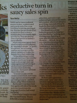
Welcome to the world of real estate agents, the modern day leaders of literature, who shower us on a weekly basis with all manner of adjectives, superlatives and seductive turns of phrase.

So much so that last weekend's Sydney Morning Herald thrust them into the spotlight with an article entitled Seductive turn in saucy sales spin. Which could have just as well been written by a real estate agent given the fact that the article was neither as seductive nor as saucy as the headline had advertised – the very thing that made me read it in the first place.

For anyone still interested (in spite of the lack of X-rated content), here it is.


As you may have noticed, the article ends with a quote from the aptly-named Byron Rose, who says, "Words can be important, but I still think good photos of a property are far more important".

I can't help but wonder where the facts fit on his scale of importance.

Wednesday, January 20, 2010

Wine not?

Recently, I have happened to pen a couple of posts about wine (here and here), both of which have been critical judgements of an industry struggling with its identity in tough times.

However, an evening meal at a local café the other week has given me reason to be hopeful.


The cafe is typical of the inner city. Petite and charming amidst the urban clutter, it opens right onto the street and provides the perfect vantage point to watch the world pass by. The food is sweet, the coffee's bitter, and they have a small but reasonable wine list – and what's more, one that has Mystery wine at the top of the list.

Why not? I'm sure that their Mystery wine is just the same as what everyone else calls house wine, but how about that for something a little more imaginative?

For me, it instantly transforms something banal into an adventure. And at $6 a glass, it's everyone's favourite type of adventure – one that's low on risk but high on story value.

Tuesday, October 13, 2009

One-name-fits-all

Naming anything is one of the hardest things you can do in life. And naming a business is no different.

It's especially hard because everyone is looking for a degree of differentiation. Not simply from a market perspective, but also from a legal one. And it's the latter that's the really tough part, because the vast majority of names have already been taken. In fact, according to a CNN report that I quoted as part of this article I wrote for B&T as long ago as 2003, 98% of the words in a typical dictionary have already been registered by one company or another.


As I outlined in the article, there's a whole range of pitfalls when it comes to naming, but here I want to focus on the question of differentiation.

In particular, I want to focus on a curious example of an entire industry where differentiation is almost absent when it comes to the name.

British pubs.

From the King's Head to the Queen's Arms. The Red Lion to the White Horse. There's an endless list of pubs with either exactly the same name, or at the very least ones that are very similar.

Maybe it's a quirk and the rules don't apply here. Maybe it's a problem, and that's why dozens of pubs are closing each and every month.

If we were to believe one of my favourite authors, George Orwell, then the name doesn't really matter so much. That is, just so long as it's called "The Moon Under Water" – the name he gave his ideal pub in a 1946 article he wrote for The Evening Standard. He may well have been right, and given that he was labelled "perhaps the 20th century's best chronicler of English culture" by none other than The Economist (and as recently as 2008), it seems only fitting that the final word should go to Orwell.

"And if anyone knows of a pub that has draught stout, open fires, cheap meals, a garden, motherly barmaids and no radio, I should be glad to hear of it, even though its name were something as prosaic as the Red Lion or the Railway Arms."

Saturday, October 3, 2009

Incest is wrong, right?

It goes without saying that incest is ill-suited to the human race.
I don't just mean legally, morally or ethically, but more so on physical or biological grounds. The make-up of our DNA demands diversity, although this is also tempered by natural selection: successful characteristics become more popular over successive generations – a fine-tuning effect, if you like.
But diversity is key.
And in the words of those towering pillars of pop philosophy, Groove Armada, "If everybody looked the same, we'd get tired looking at each other".
So forgive me the slight exaggeration, but then why do so many brands look as though they've been designed by one of the inbred hillbillies from the 1972 film Deliverance? Why do they seem so intent of denying themselves the necessary advantages of diversity, opting instead to settle for more of the same?
In their book Funky Business, published in 1999, Kjell Nordström and Jonas Ridderstråle wrote about what they termed the surplus society. In their words, "The surplus society has a surplus of similar companies, employing similar people, with similar educational backgrounds, coming up with similar ideas, producing similar things, with similar prices and similar quality".
Sounds like the commercial version of inbreeding if you ask me. People who are so scared of being different that their anxious conservatism tries to eradicate our fundamental need for diversity.
In business as in life, it is the drive for similarity that is unnatural. And our need for diversity is no less a necessity for brands.
But in spite of this, a brisk stroll down a supermarket aisle quickly becomes a blur of swooshes and swirls as brands seemingly decide it's easier to copy than compete. In the profile piece that appeared in B&T a couple of weeks ago, I wrote that most of the Australian packaging industry think "it's acceptable to regurgitate the same old boring ideas, year in year out. Even the smart people I know...can't seem to help themselves". As unfortunate as that might be – and assuming the inevitable standouts – that statement's true. The same goes for a catalogue of corporate brands, from law firms to the world of finance.
We all know that incest is wrong. Don't let diversity die.