Monday, May 10, 2010

Time for a haircut?

A little while ago, I wrote here in statistical terms about a trip to my local supermarket.

1 item every 60 seconds. $5 every minute.

And even a brief browse through Freakonomics or their blog will quickly reveal just how much statistics relate to our everyday lives.

All of which brings me to the fact that I got my hair cut the other day. Not a particularly glamorous or extravagant event, as evidenced by the fact that it was a mere snip at $13.

I entered the barbershop at 8.03am.

I was seated by 8.04am.

And I was on my merry way by 8.17am.

$1 a minute.

Not so long ago, I used to get my hair cut at a salon. And, it used to cost me $47 and take about 45 minutes.

Also, $1 a minute.

And when I think about how long my beautiful wife will tend to spend at the salon when she has her hair done, it's generally a 3-hour exercise at a rough cost of $200.

Close enough to $1 a minute.

I'm sure by now you get my point, or at least my hypothesis. That there is no such thing as a cheap or an expensive haircut, only a long or a short one (at an approximate cost of $1 a minute).

Thursday, April 29, 2010

The right brand of coffee

I love coffee. I also enjoy a good conversation. And I'm certainly not immune to a spot of conservation.

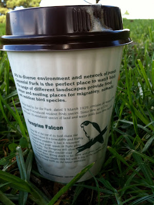
So you can imagine my delight when I came across these takeaway coffee cups at the newly refurbished café at Centennial Park.


They're a great reminder of the natural environment and the wildlife with whom we share the park, as well as a reassuring piece of communication in a world where all too often cost and convenience erase all signs of character.

Now, if only someone could design a better lid.

Tuesday, April 27, 2010

The difference between write and wrong

I receive a fair few résumés in any given week, and more so lately as I'm recruiting for a couple of roles.

Last week was no different, but one résumé in particular stood out from the rest of the bunch, albeit for all the wrong reasons. The front page led with 4 sentences, the first of which contained no less than 44 words and 2 errors – including misspelling the name of a previous agency.

From there, things didn't get any better.

80 words later, and I'd counted another 8 errors. Apostrophes turning up in the wrong places (or not at all), random capitalisation, the odd appearance of an ampersand or two, and commas missing in action or simply dropped into the middle of nowhere.

All I can say is that if you're still struggling with the difference between "who's" and "whose" after 25 years in the communications industry – and as a self-professed writer – then all is not well.

But what also struck me was the complexity of the language for something like a résumé, a piece of communication that ought to be simple, approachable and immediate. I've written here about the fact that using long words does not make you appear smarter (in fact, quite the opposite), and I was also reminded of the Flesch-Kincaid readability test.

This is a test that – as the name suggests – measures how easy it is to read a passage of text, and provides a score on a scale of 0–100. Reader's Digest aims for a score of 65 or more, whereas the Harvard Law Review tends to hover around the 30-mark. So far, this post gets a score of 60.

The 4 sentences on the front page of the résumé achieved a Flesch-Kincaid score of just 16. A pretty ordinary effort when you also consider the number of grammatical errors, and a stark reminder of the power of language, for better or for worse.

I sincerely hope that the author of the résumé finds a role, but I can't say for certain that it will be in communications.

Monday, April 19, 2010

Ads that do no more than pay the Bill

It's been a little while since my last post, but I have renowned chef and restauranteur Bill Granger to thank for giving me just the jab in the kidneys that I needed to get back me into the blog seat.


On this particular occasion, Bill was not plugging his latest book but rather his love for Poliform kitchens – and I'm not surprised given that Bill's one of the few people that could probably afford one. But what grated about the ad that I saw (one of a series of ads including the one shown above) was the complete lack of imagination when it came to the copy.

My Poliform kitchen combines the best ingredients – elegance, functionality and quality and it's not as expensive as you think.

I'm all too well aware that clients often set incredibly tight deadlines, but surely the agency in this case had the time or creativity to do more than simply copy–and–paste the brief into the ad? But then if you don't know what you're doing, even the best ingredients can leave a bad taste.

Sunday, March 28, 2010

Brand incontinence

Over the years, the somewhat myopic response to the question of marketing effectiveness has too often been one where activity was initiated in the name of branding as a mere proxy for awareness, but with nothing more concrete or rewarding in place in terms of measurement.

It's a lazy response that makes for a lazy investment.

And last week, I heard a great quote in which a department head at a news and media organisation expressed his opinion on the impact of branding. Or, to be precise, the lack of it.

If I wanted a warm and fuzzy feeling that nobody notices, I'd piss my pants in a dark suit.

Wednesday, March 24, 2010

Conference confidence

If I'm honest, I'd have to say that I hate the whole meet-and-greet merry-go-round that goes with conferences and seminars. And that's even though every rational bone in my body tells me they are unrivaled opportunities for meeting new people in an industry built on people, their ideas and opinions.

For me, they're the corporate equivalent of a high school dance – fun if you thrown yourself into the thick of it, but so easy to misjudge the mood and the moment as you break bread with strangers in a hotel ballroom that's seen better days.

Kinda crazy, really.

So I was curious to say the least when I noticed this tweet from 99%.


And with a tentative click, I decided to try my luck and follow the link to this post by Jodi Glickman Brown on the Harvard Business Review blog.

It did take me a couple of reads to get used to the idea of what she has to say, as well as interpret some of the cultural nuances in a more personal context, but deep down I know she's right.

The only question now is whether I attempt the Group Tackle or the Single Sideliner first.

Monday, March 22, 2010

So good they wrote it twice – or was that three times?

Just last Friday, a good friend pointed me in the direction of what can only be described as a thrilling piece of copywriting.

The quality of the writing and craftsmanship is jaw-dropping. No word of a lie.

And here it is.

But a quick scroll through the comments on YouTube tells another story, one of perceived mistrust and deception. So much so that Penguin published their own blog post to defuse the story and acknowledge their inspiration, even going so far as to include links to two particular videos where this same approach has been used in the past, here and here.

Who knows the true story in terms of how events unfolded? Whether Penguin were transparent from the start or even knew that the video had been posted, or if it was those ever-watchful, web 2.0 vigilantes who caught them out with their own brand of cyber sleuth.

Whatever the case, you can be absolutely sure of one thing.

Jason LaMotte, the chap who wrote the script for the video, is a great writer.

And most certainly a far greater writer than the vapid vultures whose comments have so quickly picked to bits what is otherwise an inspired piece of language and communication.

Right or wrong, inspiration or imitation, I know whose words I'd rather read.

Friday, March 19, 2010

My Sunday shop, statistically speaking

Last Sunday, I became the Main Grocery Buyer in our family for a day.

It's true that I spend a fair amount of my week with my head in the world of retail, but I have to admit that I rarely ever get the chance to experience a store as a happy-go-lucky, Sunday shopper.

Thinking about doing something is never quite the same as actually doing it, a point well-proven recently by a good friend who used his blog, Brand Habits, to dabble in the world of crowdsourcing with $150 of his own money – you can read about the highs and lows of that experience here.

And so it was that the whole experience was a real eye opener for me.

Quite literally, seeing as I spent most of the shopping trip feeling incredibly overwhelmed by the sheer volume of information that was being pumped to my brain by my eyes. So much so that my brain is still compulsively processing much of the data, and every so often I feel my hand reach out in front of me to grab what it thinks is a tub of Philadelphia cream cheese or some other sundry item from a shelf in my mind's eye.

But as much as I was pretty overwhelmed, I was equally amazed by the fact that I didn't return home with a single incorrect item (although I did forget a few things and/or ran out of time as my 18-month old son ran out of patience). However, as I scoured the shelves for what looked like stuff that usually turns up in our fridge and freezer, cupboards and drawers – without a shopping list, I should add – shapes and colours were the things that invariably guided me to the right item.

In fact, those semiotic design cues are the only reason that a shopper can make it through a supermarket in anything like a reasonable amount of time – and I give my full sympathy to any label readers out there for the amount of time it must take them.

As for my trip, I was in the store for 90 minutes.

In which time, I bought 98 items.

Which means, on average, I was putting into my trolley 1 item every 60 seconds.

No wonder I was feeling overwhelmed, that's quite a workout – mentally and physically – but one that would be impossible if it weren't for the role of design.

But that's not all.

In total, my shopping came to a total of $464.96.

That's over $5 for each and every minute I spent there.

Which strikes me quite a high amount for something that is meant to be built around a low service, value model. Imagine spending $5 a minute at a cinema or restaurant, experiences where service comes at a premium. (As an aside, feel free to check out this post I wrote about Paul McCrudden and his 6 Weeks project to read an interesting take on the value of the time you spend with brands.)

For me, those two statistics say it all.

On the one hand, the supermarket shopping experience is fast and furious, a flurry of split-second decisions as you charge up and down one towering aisle after another.

On the other, it's hardly a cheap way to spend your time with a brand that typically provides barely more than a large warehouse full of commodity-priced produce – I admit that is something of an over-simplification, but you get my drift.

As I write this, both Coles and Woolworths are locked in what looks like shaping up into a mammoth battle for our time and money after years of dominance by Woolworths. What's more, the launch of Thomas Dux by Woolworths and the store renewal program at Coles are both strong signals of what's to come.

After years of stack 'em high, sell 'em cheap, they are now becoming far more interested in how we spend our time, not just our money.

Tuesday, March 16, 2010

A healthy dose of insight

My wife is currently studying medicine – through Google, it seems.

Whenever she or one of our sons is sick, her first port of call is always to type some pithy description of the symptoms into the search field. That way, she can at least rule out any terminal diseases before preparing herself for discussions with her assistants at the local surgery. It all comes down to access to the right information – not that there's anything wrong with that.

But what I'm finding more and more is that the age-old adage knowledge is power is no longer true.

In fact, it's now more accurate to say that information is power.

And that, I think, is a problem because you'd have to be crazy not to acknowledge the gulf that exists between the two (as does my wife, fortunately).

Knowledge comes through understanding and experience, whereas information simply litters our lives, an often random sequence of data, symbols and other bits and pieces. Knowledge makes sense of information, whereas information on its own can often be senseless, unless of course you know what to do with it.

Which brings me to research.

Focus groups are typically the whipping boy for why research is so often so flawed, but that's too easy and obvious a target – plus, my friend Ingrid over at Aesthetics of Joy (the Christmas trees, remember) already wrote this article a few years ago that perfectly summarises the bigger issues.

But what frustrates me is the seemingly blind proliferation of information churned out by your typical research agency.

They can tell you what was said. In fact, they'll happily write dozens of slides in 8-point type, and even throw in the odd piece of Clipart for a little light relief – if there's space on the slide, they'll be sure to fill it.

But they can rarely tell you what it means.

They'd rather leave that to a mother of two from Castle Hill who you've just paid $80 for 90 minutes of her time to design the pack or write the tagline for you. Easier than making the decision yourself, plus you've now got someone to blame just in case.

Research has its role to play and there can be no doubt that the most successful brands are consumer-informed, but they are never consumer-led. If that was the case, then we'd all be riding faster horses, to paraphrase Henry Ford.

In the case of research, knowledge typically makes sense of information through insight.

But unless more research agencies are able to transform all this information into even the smallest morsel of insight, then my wife may not be the only one turning to Google for the answers.
Monday, March 15, 2010

Eyes wide open (thanks, Grace)

Not so long ago, I wrote here about The Writer, just one of many posts about the way in which brands use language to distinguish themselves – in both senses of the word.

And it reminded me of uncompromising brands like Gym Jones, a gym in Utah that prides itself on nothing less than Power, Speed, Endurance, Suffering and Salvation.


As you can read for yourself in this exert from their website, they're pretty serious about what they do (and don't).


I wish more brands took themselves so seriously that they held to such an unwavering view of their place in the world, rather than allow punters to wander into a focus group and make all the important decisions for them. But alas, such instances seem few and far between.

Unless, that is, you know where to look.

It was Grace Coddington, Creative Director of American Vogue, who spoke in The September Issue about how she learnt early in her career that you should always keep your eyes open, never go to sleep in the car or anything like that, keep watching – because whatever you see out the window or wherever, it can inspire you.

And so it was that I found myself staring out of the passenger window on Saturday morning as we drove along the incredibly uninspiring and downright demoralising Parramatta Road.

All these thoughts were rattling around in my head when out of the blue – or should I say gray? – I saw a furniture store called 3 Of A Kind with this brutally honest tagline.

Butt ugly blokes building handsome furniture for beautiful people.

I wish we'd stopped to find out if it was true, but I can only imagine that there's few better places to go if you want an honest piece of original craftsmanship.

And if that wasn't enough, we then drove straight past this tattoo parlour.


Where better to go than the House Of Pain?

Friday, March 12, 2010

On the record

I was rummaging through my record collection at the weekend, and it inevitably got me thinking about album artwork.

For me, part of the romance of records is simply a question of size – 12 square inches have always trumped the compactness of the compact disc. And from Factory Records and the work of Peter Saville to the team at Stylorouge at the height of Britpop, I've forever been fascinated with this pivotal point at which music meets design.

In the 60s, Warhol led the way with his multimedia aesthetic and the help of the band he was managing at the time, The Velvet Underground. And by the time 1969 rolled around, it made perfect sense to Mick Jagger of The Rolling Stones to ask Warhol to design their next album sleeve.

And so he did. In fact, here's the letter he wrote Warhol to brief him on the project.


Do whatever you want.

Please write back saying how much money you would like.

Take little notice of the nervous requests to "Hurry up".

Not exactly your typical brief, but then Jagger wasn't looking for your typical response.

And here's the result, complete with working zipper for that added touch of sexual tension (not that you can quite tell from the visual, sorry).


If it's true that you do your best work for your best clients (have a read of this post for more on that matter), then I'd certainly say everyone could do with a Jagger or two at some point in their career.

Tuesday, March 9, 2010

This is your airplane speaking

I've written in the past about infographics – first here, then here. Because I firmly believe that data doesn't have to be dull. Or, to put a more positive light on it, information is beautiful.

And I have a work colleague to thank for pointing me in the direction of this blog and its brilliant infographic as the livery for a South African airline called Kulula.

As you can see, Kulula have always been the creative types when it comes to painting their planes over the years.


But this latest design is truly outstanding. Quite literally.


That's it. The airplane says it all really.

Monday, March 8, 2010

365 and counting

This latest post began life as a brief rant by one of my colleagues at work.


Something to do with the fact that Yakult – like so many other brands – are now positioning themselves as every day.

And just in case that phrase is simply too hard for us poor consumers to grasp, they've kindly gone to the trouble of placing their product next to other products that you might also expect to consume every day. In much the same way that orange juice brands like to put a picture of oranges on the front of the pack just in case you weren't sure what a product described as orange juice might contain.


And that was pretty much where my colleague's rant ended. Just another Friday afternoon in the agency.

But it started me thinking about how everything is now becoming marketed as everyday.

We're spruiked everyday low prices. Where everyday matters are the key to everyday living. And we're told to get our everyday money with everyday banking. Because every day is an adventure. Especially if we want to get everyday rewards. Or, even better, be an everyday hero. That's when we can enjoy everyday luxury. In fact, when you think about it, we're just part of everyday.

It's everywhere.

Which is ironic given that we're also being constantly reminded by our marketing masters exactly how time-poor we all are.

So what's going to be? Everyday, or just whenever we can.

Thursday, March 4, 2010

Can I have a small word?

I've been meaning to write this post for months. In fact, ever since I first read about it last August. And once again, I have The Writer to thank, a specialist writing agency in London.


Here's what they had to say.

Long words make you sound thick. Fact.

We’re always banging on in workshops about picking simple words whenever you can. Occasionally, though, someone will pipe up, ‘But I like using long words. They make me look clever, don’t they?’ No, they don’t. And you don’t just have to take our word for it. It’s been scientifically proven – by psychologist Daniel M Oppenheimer, of Princeton University, no less.

A couple of years ago Oppenheimer designed several experiments to test how people reacted to various styles of writing – some straightforward, some complicated. He was particularly interested in trying to find out which writers sounded the cleverest.

And guess what? The writers of clear and simple words were judged as smart, whereas those who used needlessly long words came across as less intelligent and less confident.

His conclusion is emphatic: ‘Write clearly and simply if you can, and you’ll be more likely to be thought of as intelligent.’

If you fancy reading the study yourself, it’s here. It’s rather splendidly called Consequences of Erudite Vernacular Utilized Irrespective of Necessity: Problems with Using Long Words Needlessly.

A brilliant insight, if you ask me. And I'd expect nothing less than that from The Writer, who seem to take as much time over the long words as they do the fine details.

To show exactly what I mean, here's the email signature from their newsletter (double-click on it to see a larger version).


So many people struggle to describe what makes their business or brand different, but here it is, laid out for all to read in something as basic as an email signature.

No multi-million dollar advertising campaign, exhaustive packaging redesign, or public relations crusade required.

Just a few small words say it all.

Wednesday, March 3, 2010

Hello, is there anybody there?

A little over a fortnight ago, I had a very curious phone call.

It was the Managing Director of a packaging agency calling for a quick hello and my email address so he could invite me for a coffee. Nothing too unusual about that, although I did feel a little uncomfortable as I've never really met this person for more than 60 seconds or so – and even that was more than 5 years ago.

Nonetheless, I quickly drew up a list of possible reasons for why he'd want to meet.

1. He wants to hire me.

2. He wants me to hire him.

3. He wants to see how much competitive information he can get out of me about our own agency's plans.

4. He's read my blog and wants me to ghostwrite his autobiography.

But the sad thing is that we'll never know, because he never did send me that email invite afterall.